Petal Passion brand case study
Project: Fresh new rebrand for Cambridge florist, Sharyn
The Client
Some people come into your life at a wedding expo and just never leave — and honestly, thank goodness for that.
Sharyn from Petal Passion is one of my absolute favourite humans, and getting to work on her rebrand was every bit the treat you'd expect. She's been building her florist business with genuine passion and artistry for years, and her brand deserved a refresh that honoured everything she'd created — without losing what made it hers.
The Challenge
This wasn't about starting over. Petal Passion had an existing identity that Sharyn's clients knew and loved — and that was worth protecting. But like any brand that's been working hard for a few years, it needed a little freshening up.
She needed a brand that:
Felt modern and current without abandoning its roots
Reflected the personality and warmth that Sharyn brings to every single arrangement
Worked beautifully across both print and web — with enough flexibility to be genuinely easy to use
Felt like Petal Passion, just elevated
The Approach
We started by getting clear on what to keep and what to evolve — because a good refresh is as much about restraint as it is about change.
Together we worked through:
What still worked — the brand recognition Sharyn had built, the essence of the existing identity, and the elements her clients connected with
What needed updating — the colours, the shapes, the typography; all the things that were doing the job but could do it so much better
What the refreshed brand needed to communicate — freshness, personality, and the kind of quiet confidence that comes from a florist who truly knows her craft
Then we got to work:
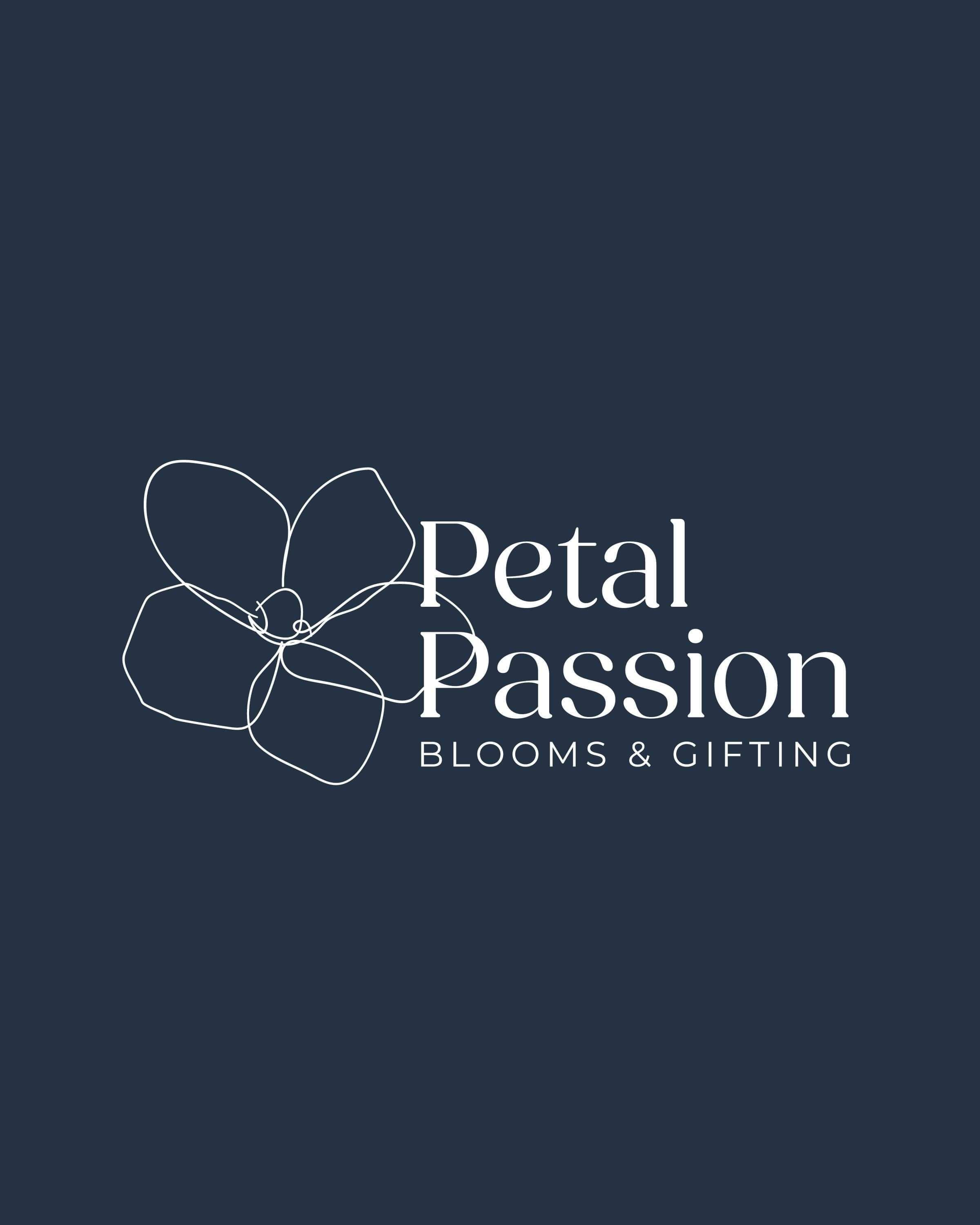
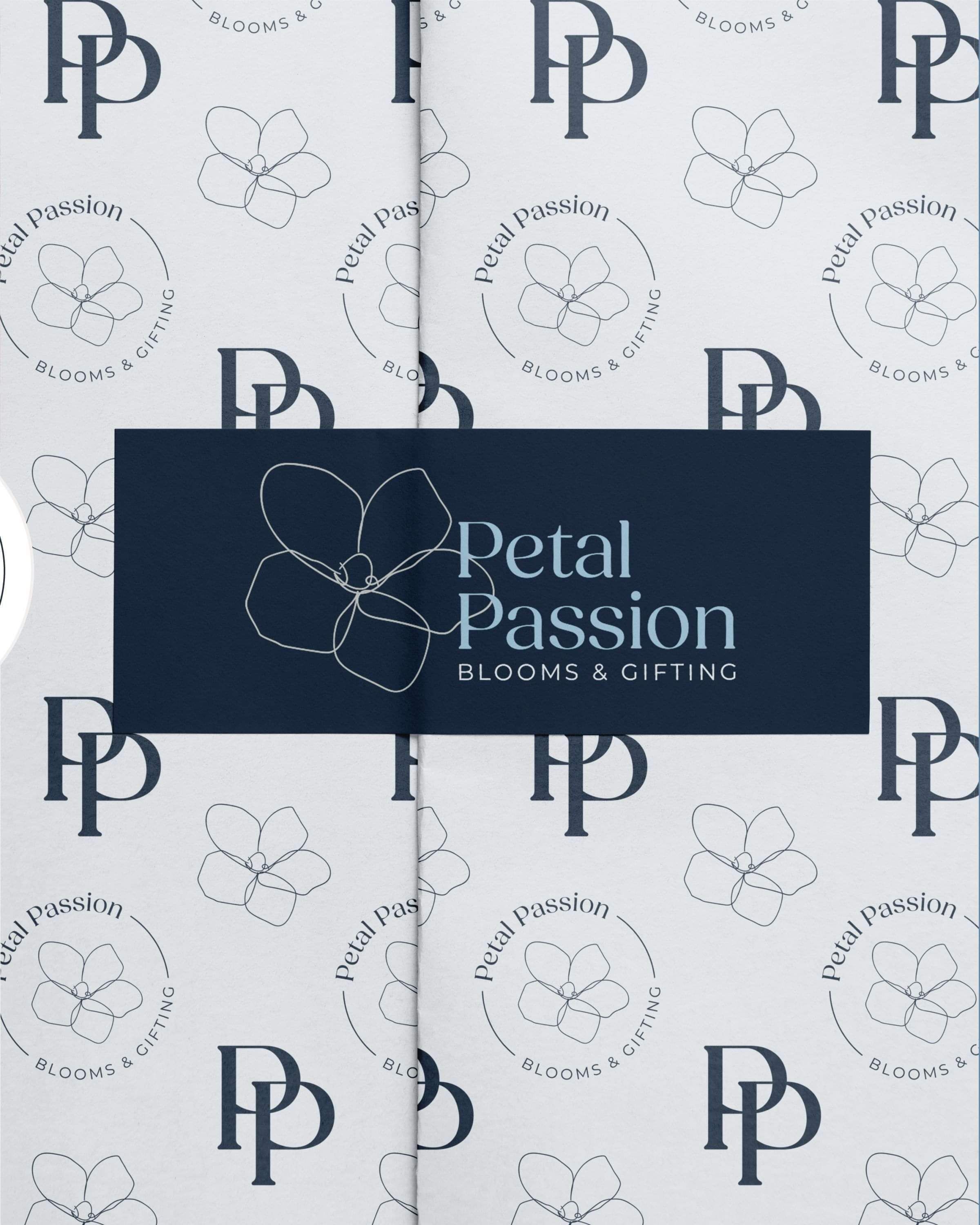
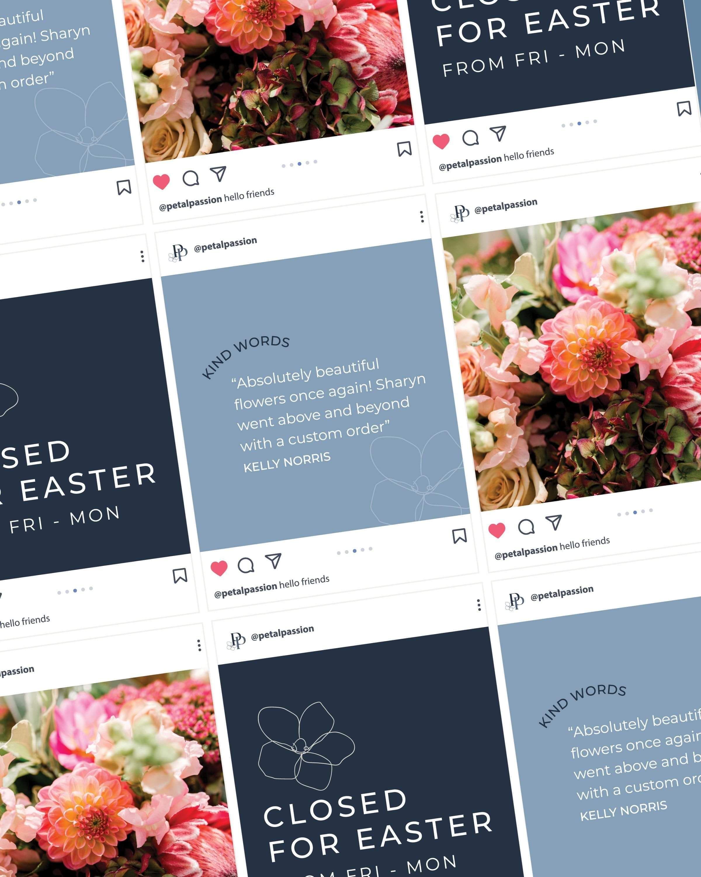
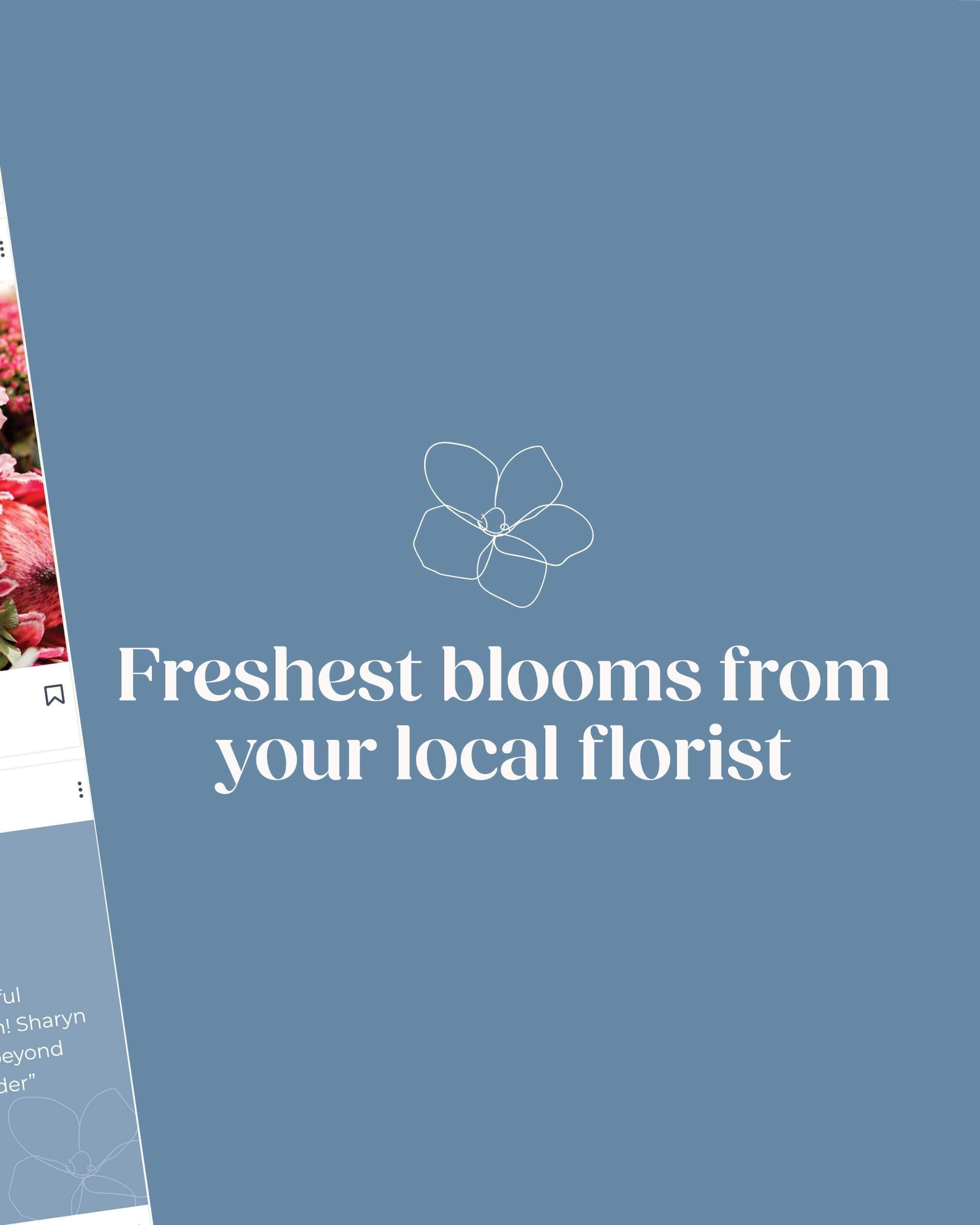
An updated colour palette — a fresher, more considered collection of blues and neutrals that feel both modern and timeless
Modernised shapes and florals — refining the existing elements so they feel current without losing their familiarity
New font pairings chosen to complement each other while reflecting the true personality of Petal Passion
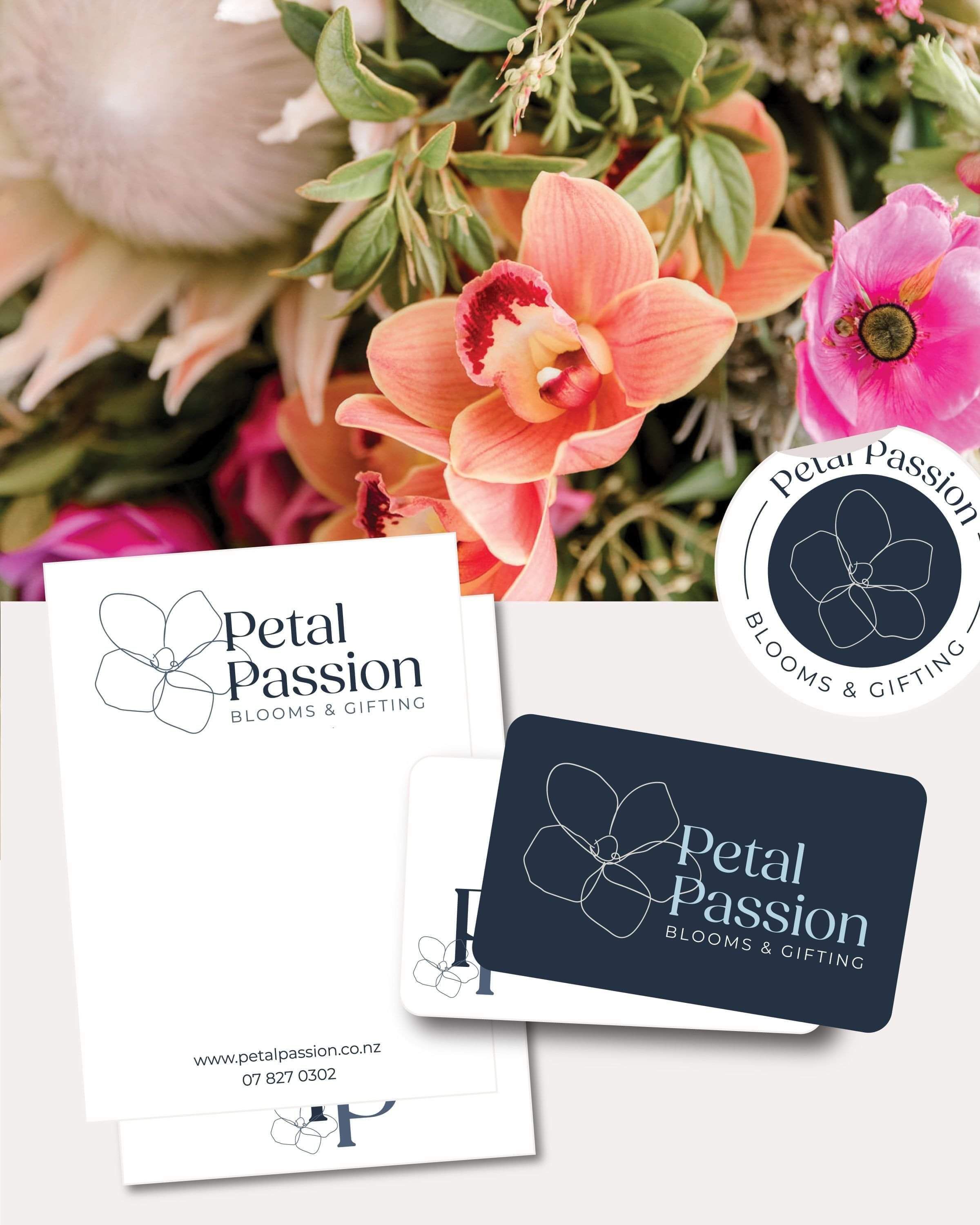
A suite of logo variations built for real-world use — so Sharyn always has the right version for whatever she needs, whether it's a website header, a printed card, or anything in between
The Solution
The result is Petal Passion, refreshed — familiar enough that loyal clients will recognise it instantly, polished enough that new ones will be immediately impressed.
Everything works together with a cohesion the original was missing, and Sharyn now has a brand toolkit that's genuinely easy to use across every touchpoint without second-guessing herself.
A fresh, modern colour world that still feels completely Petal Passion
Refined logo and floral elements that have grown up beautifully
Versatile logo variations ready for print, web, signage, and social
A brand that reflects the quality and artistry Sharyn brings to every bouquet
The Results
Petal Passion now has a brand as beautiful and considered as the flowers Sharyn creates every single day.
It was such a treat to work on!
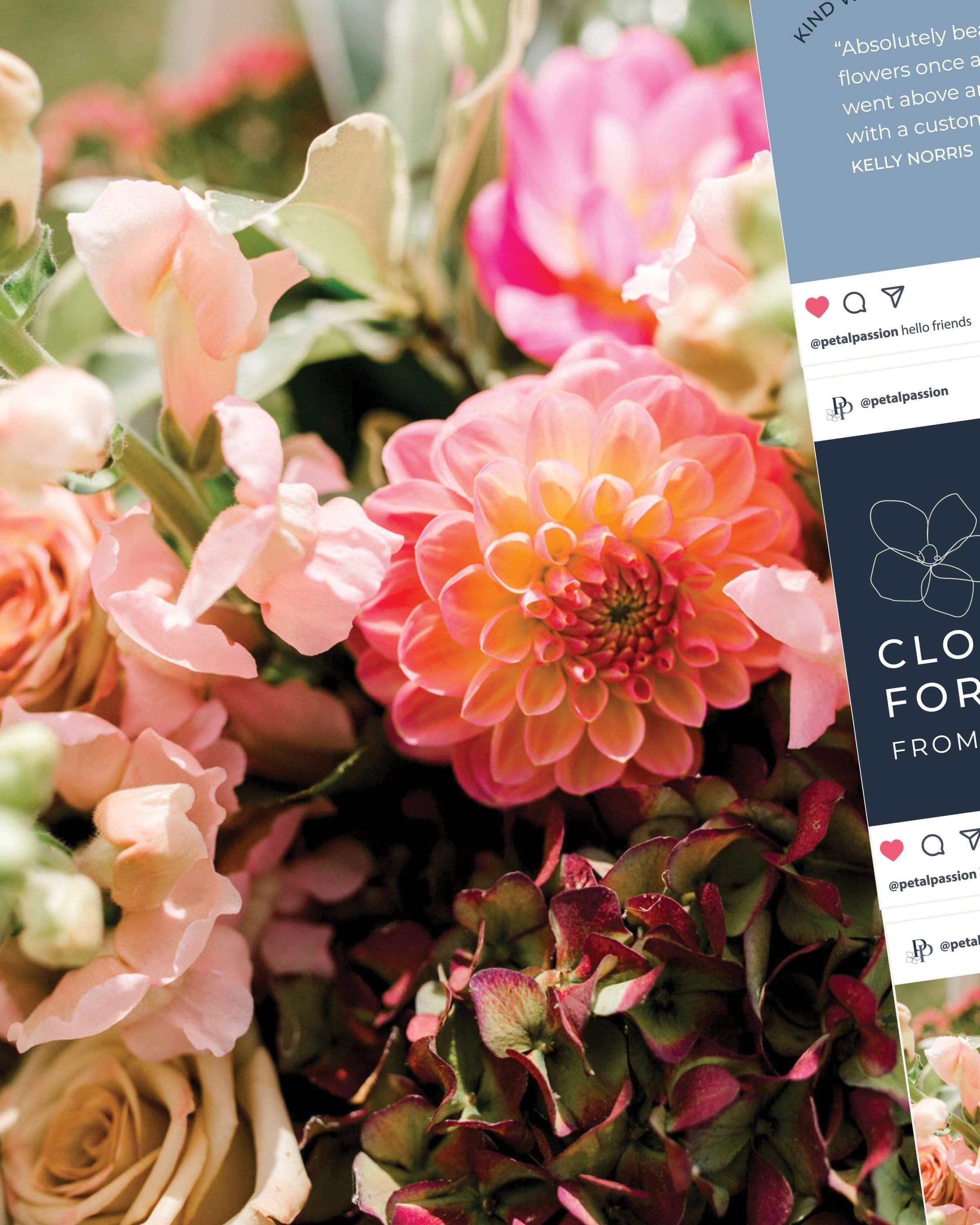
Kind words from the client
"So glad I put my trust in Kelly to refresh my businesses logo, she listened to what I needed and managed to get out what was in my head 100% and it looks fantastic. Kelly's communication was admirable, and I knew exactly every step she was taking all the way which was appreciated. I wouldn't hesitate in recommending Creative Box."
Sharyn, Petal Passion, Cambridge
Ready to work together?
Ready to dive in? Book a free 20min discovery call and we'll talk through your goals and get the ball rolling!
Not sure what you need? Start with a Brand Audit, we'll figure out exactly what's holding your brand back and what needs to happen next.
Based in Kihikihi, Te Awamutu, working with ambitious growing businesses across New Zealand.
ABOUT
A Waikato graphic design studio helping New Zealand businesses get noticed, attract the right clients, and grow through strategic branding & websites.
GET IN TOUCH
kelly@creativebox.co.nz
0272468761
INFORMATION
About
Recent Work
The Process
Blog
Contact