NeuroFocus Consulting brand case study
Project: Fresh new brand design for consultant, Donelle
The Client
The wildly wonderful Donelle from NeuroFocus Consulting landed in my inbox during 2025 — and honestly, our consultation was one for the books. Equal parts strategy session and delightful chaos, just the way I like it.
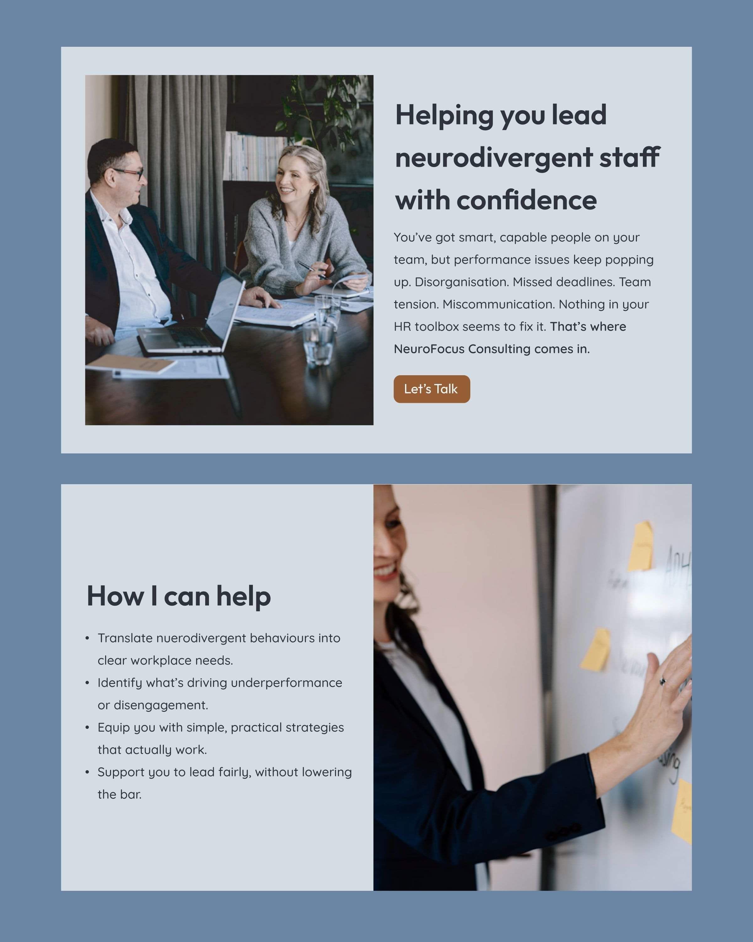
Donelle is a specialist in leading neurodivergent staff with confidence — helping organisations unlock the incredible strengths that come with diverse thinking. But here's the thing: her existing brand wasn't doing justice to the depth and nuance of the work she does.
The Challenge
Donelle operates in a corporate world — so her brand needed to hold its own in boardrooms and professional settings. But it also had to tell the full story: the warmth, the approachability, the honesty, and the beautiful complexity of neurodiversity itself.
She needed a brand that:
Felt credible and polished in corporate environments
Reflected her genuine warmth and human-first approach
Captured the intricacy and richness of neurodivergent thinking
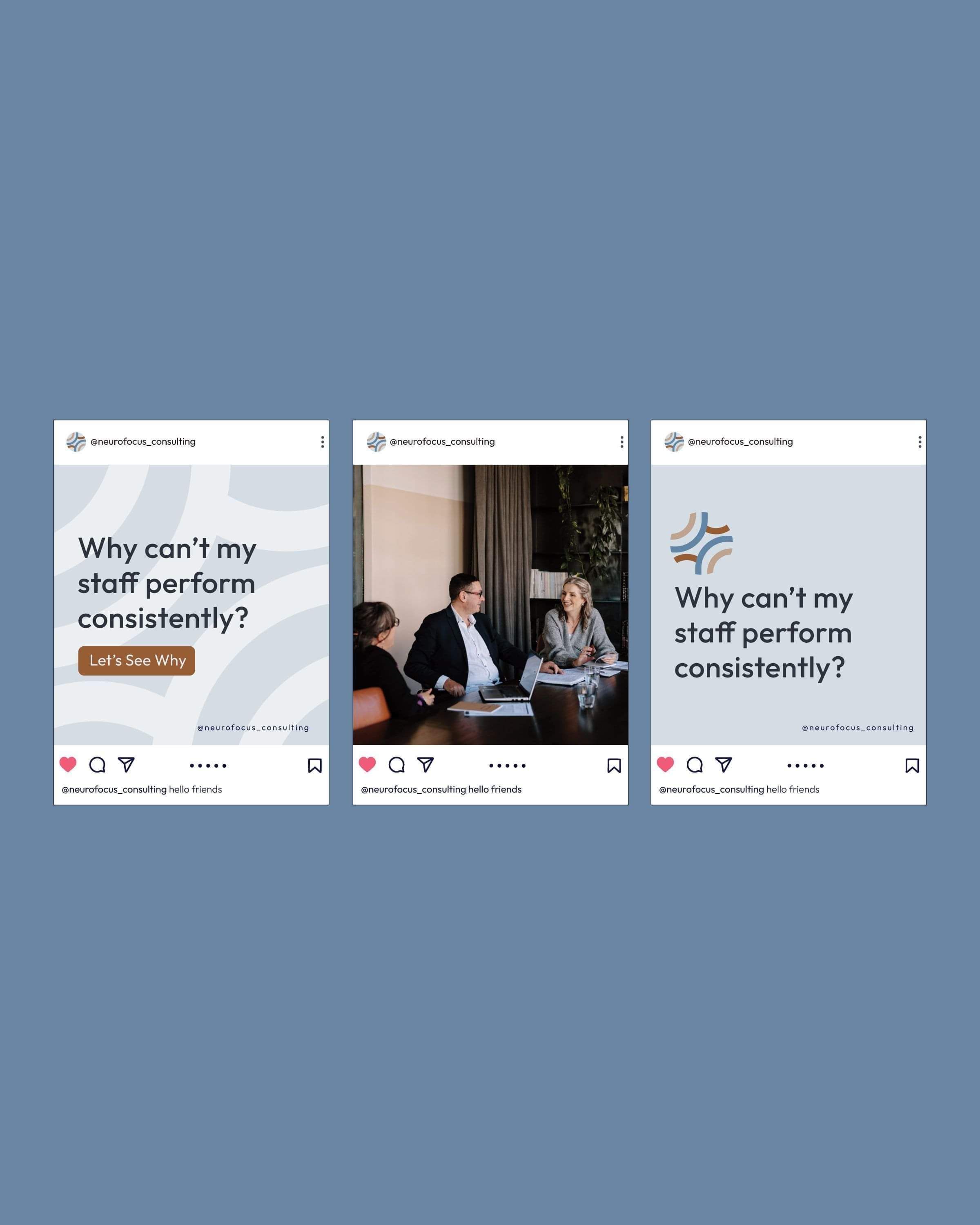
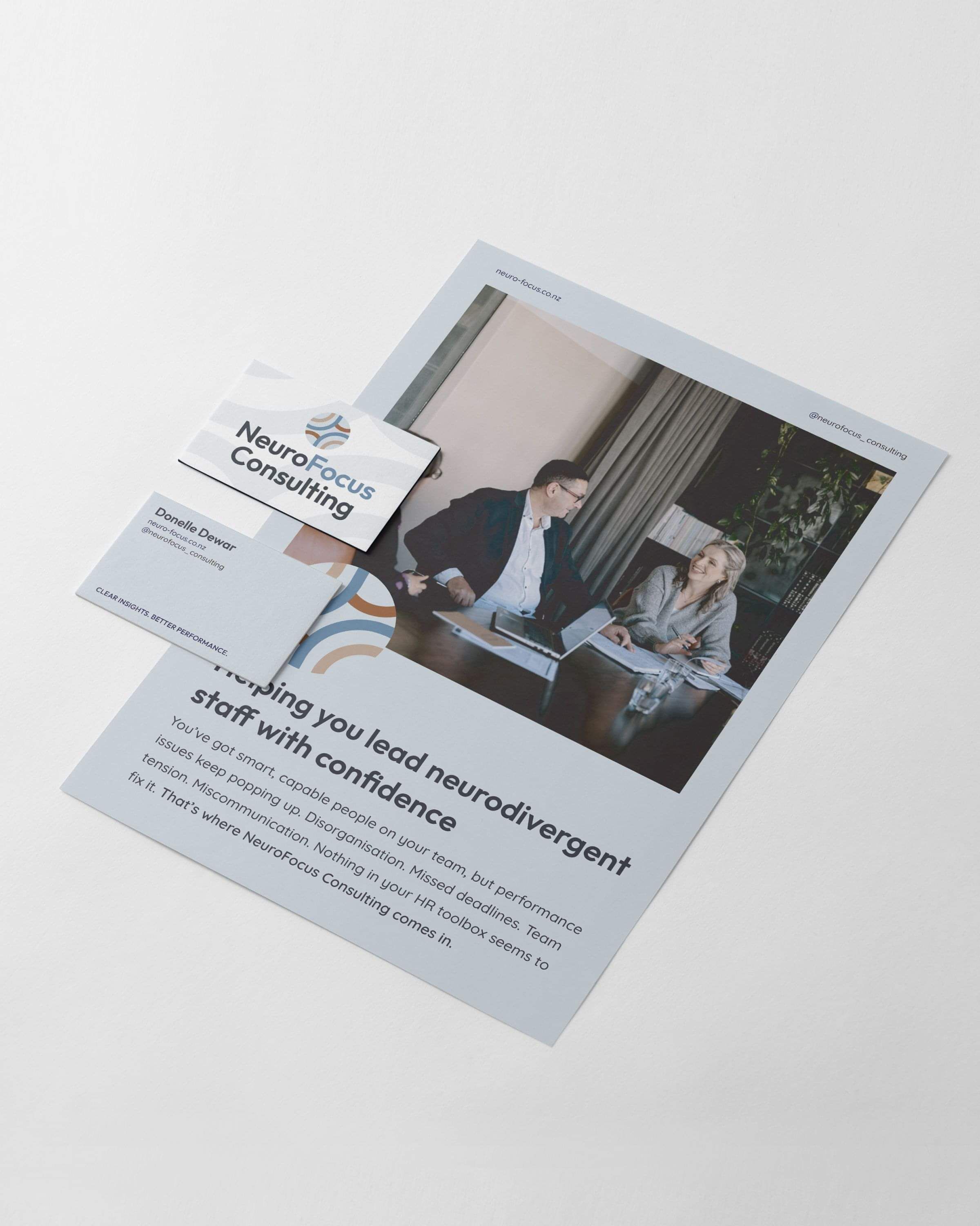
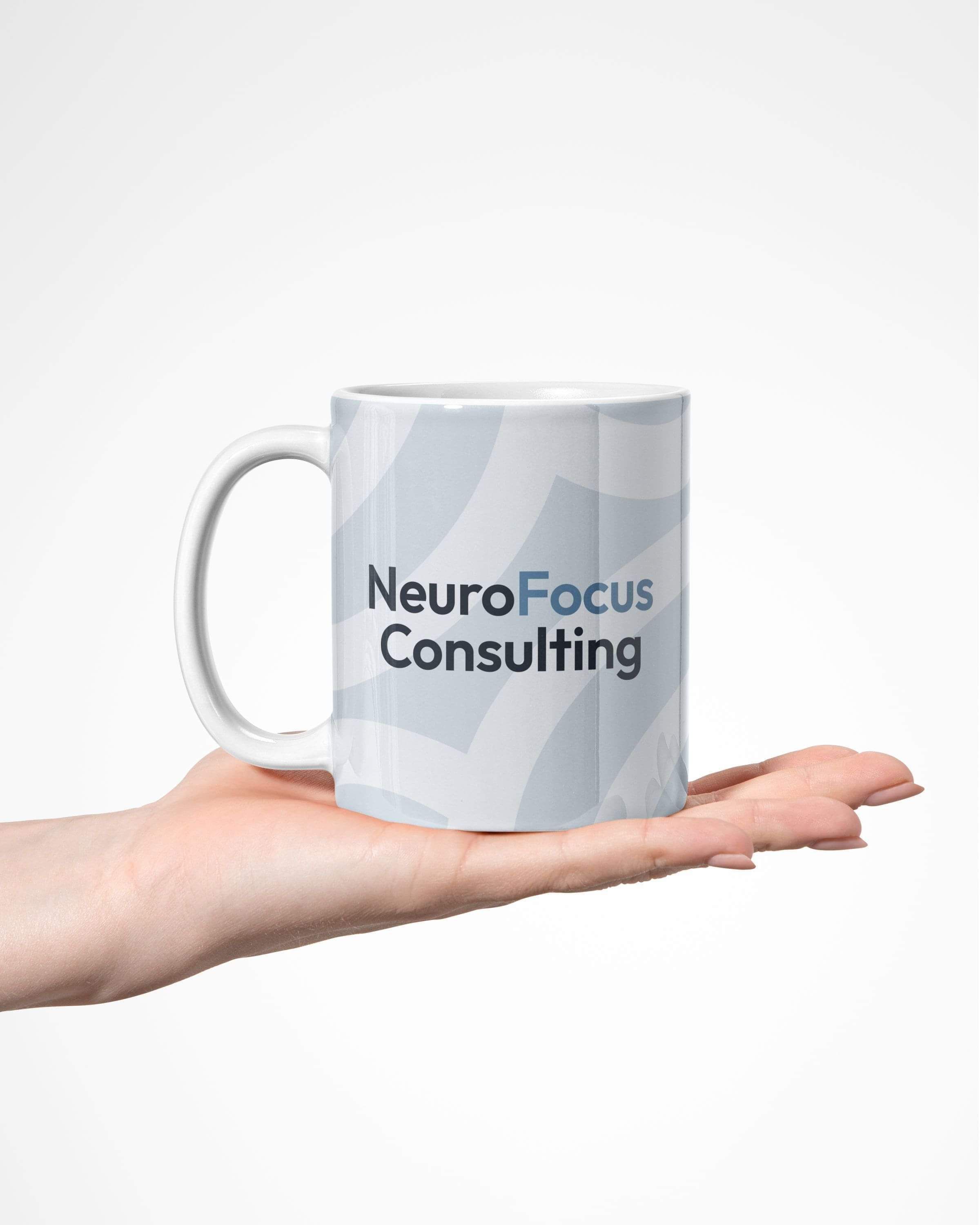
Worked hard across every touchpoint — social media, website, and print
The Approach
We started, as always, with strategy before aesthetics.
Together we worked through:
Who Donelle's ideal clients are — not just any organisation, but forward-thinking leaders ready to genuinely embrace neurodiversity as a strength, not just a checkbox
What makes her different — her rare ability to bridge the corporate and the human; bringing specialist knowledge with zero jargon and a whole lot of heart
What the brand needed to communicate — authority and credibility with approachability and warmth. Both. At the same time. (Tricky to pull off — but so worth it.)
Then we built the visual identity to carry all of that:
A strong colour palette with beautiful, high-contrast combinations — sophisticated enough for the corporate world, bold enough to be memorable
Typography pairings that balance professionalism with personality
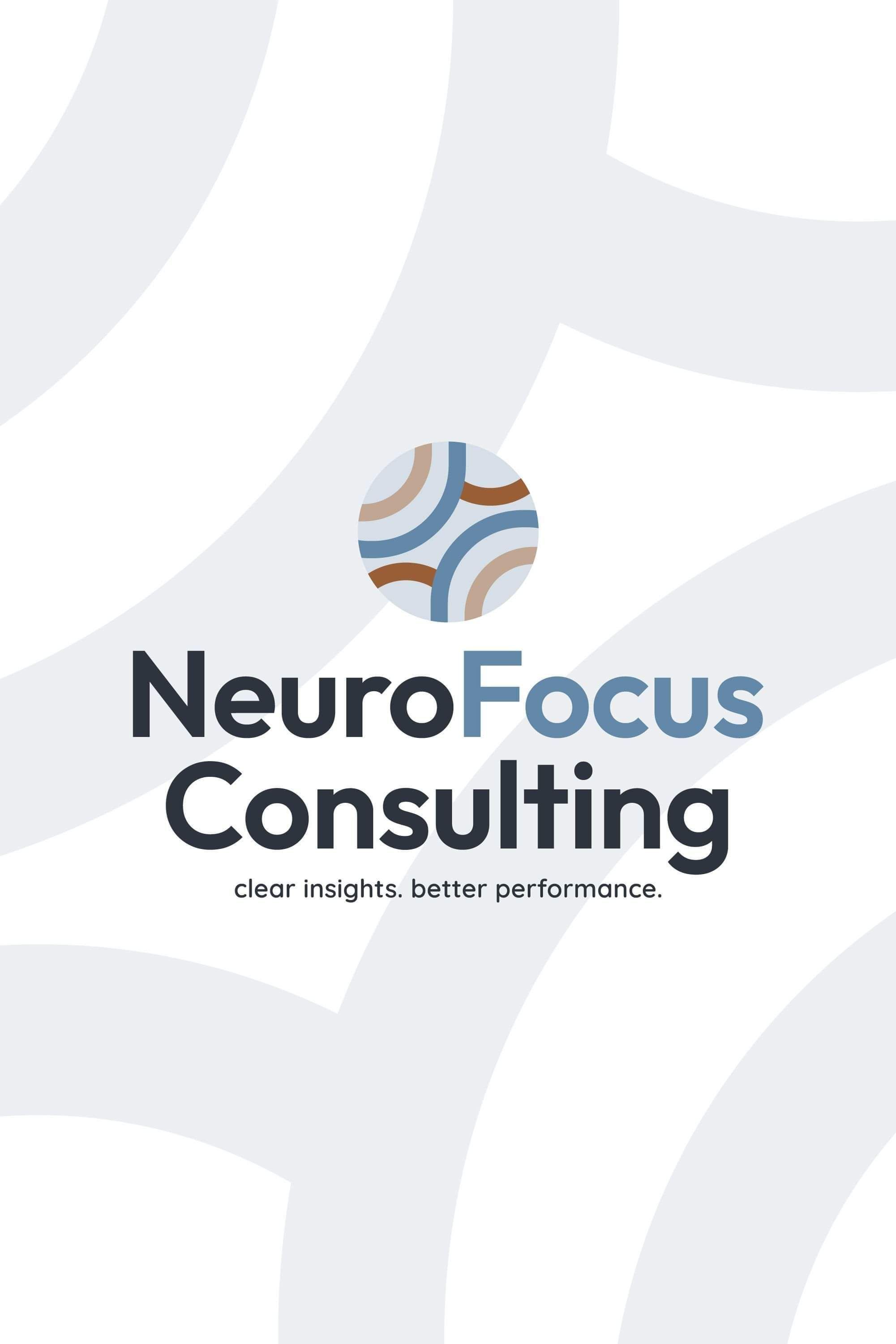
A custom pattern icon inspired by the intricacy of neurodivergent thinking — adding depth and character without losing polish
A cohesive brand framework that translates consistently across Donelle's website, socials, and printed materials
The Solution
The result is a brand that lives comfortably in two worlds — and makes it look effortless.
Donelle now shows up as the credible, trusted expert she is, while never losing the warmth and accessibility that makes her genuinely different from anyone else in her space.
A visual identity that speaks directly to corporate decision-makers and the neurodivergent staff she champions
A pattern element that adds personality and doubles as a recognisable brand signature
Consistent, versatile assets ready to go wherever Donelle goes
The Results
Donelle has a brand that finally matches her expertise — one that opens corporate doors while staying true to everything she stands for.
Such a fun, meaningful project to be part of. Here's to more of them!
Ready to work together?
Ready to dive in? Book a free 20min discovery call and we'll talk through your goals and get the ball rolling!
Not sure what you need? Start with a Brand Audit, we'll figure out exactly what's holding your brand back and what needs to happen next.
Based in Kihikihi, Te Awamutu, working with ambitious growing businesses across New Zealand.
ABOUT
A Waikato graphic design studio helping New Zealand businesses get noticed, attract the right clients, and grow through strategic branding & websites.
GET IN TOUCH
kelly@creativebox.co.nz
0272468761
INFORMATION
About
Recent Work
The Process
Blog
Contact