StarSafe App website case study
Project: Creatively bold website design to attract tradies to the new StarSafe App
The Client
Health and Safety compliance for New Zealand tradies — not exactly the most glamorous brief on paper. But this one? This one was an absolute treat.
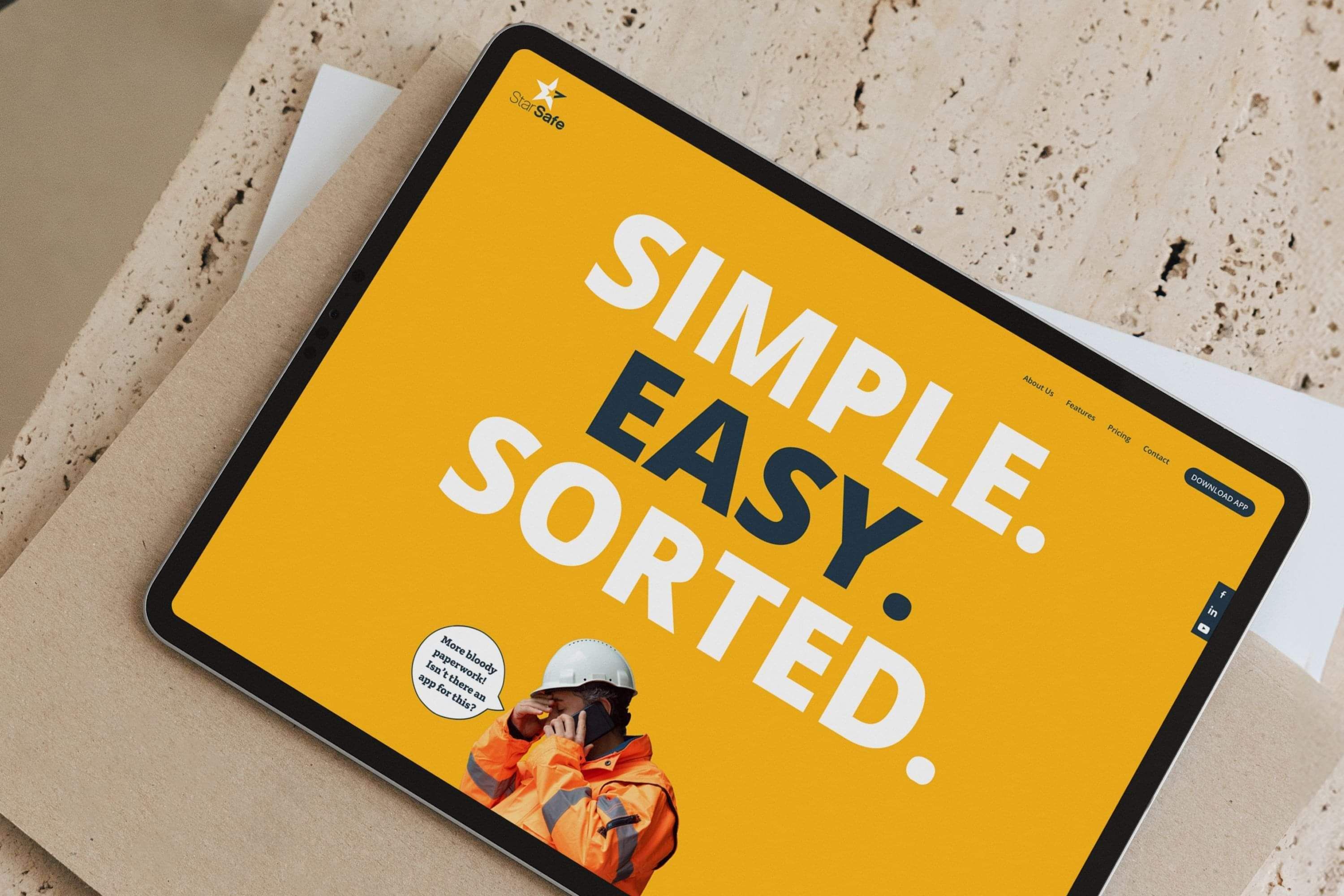
StarSafe had built a genuinely smart, practical Health and Safety app for the trades industry, and they needed a website to match. Bold. Fun. Clear. Straight to the point. And — the detail that made this brief particularly exciting — almost entirely in yellow.
Mission accepted. 😄
The Challenge
Health and Safety is a space that tends to take itself very seriously. Lots of corporate navy. Lots of dense text. Lots of websites that make compliance feel even more painful than it already does.
StarSafe wanted to do the opposite — and they were right to.
The website needed to:
Cut through the noise of a crowded, often dry industry with something genuinely bold and memorable
Communicate the app's key features clearly, without getting lost in technical jargon
Feel accessible and easy to navigate for tradies who don't have time to wade through complexity
Make Health and Safety compliance feel — dare we say it — easy
The Approach
With only three colours to work with — navy blue, white, and yellow, with yellow doing the heavy lifting — the brief demanded creativity within constraint. And honestly? Some of the best work comes from exactly that.
Working alongside wordsmith Courtney Haines, we mapped out a website experience built around clarity and confidence:
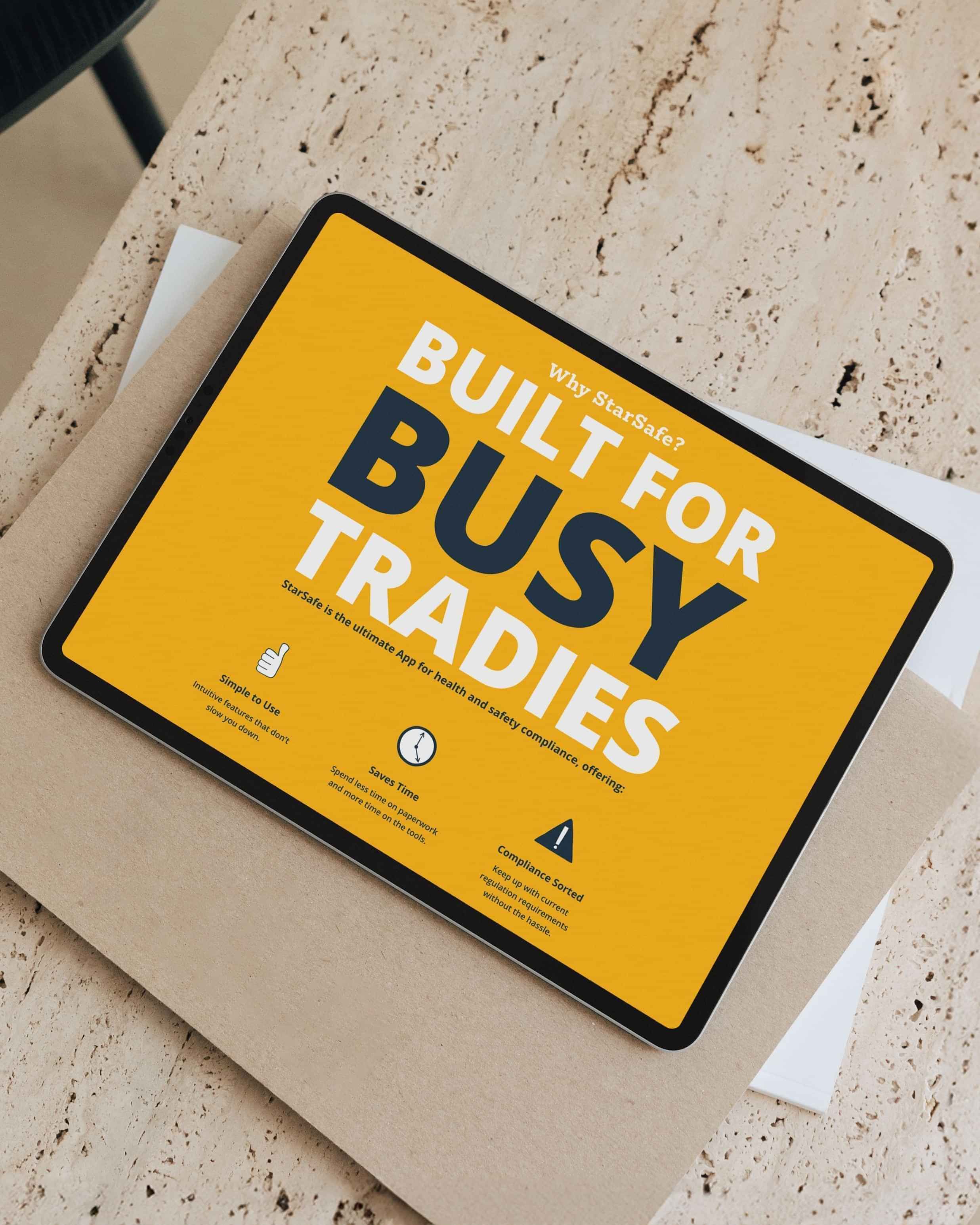
Bold statements front and centre — cutting straight to the app's key features without burying them in paragraphs of explanation
Fun, purposeful emoji use to lighten the mood and remind visitors that compliance doesn't have to be soul-crushing
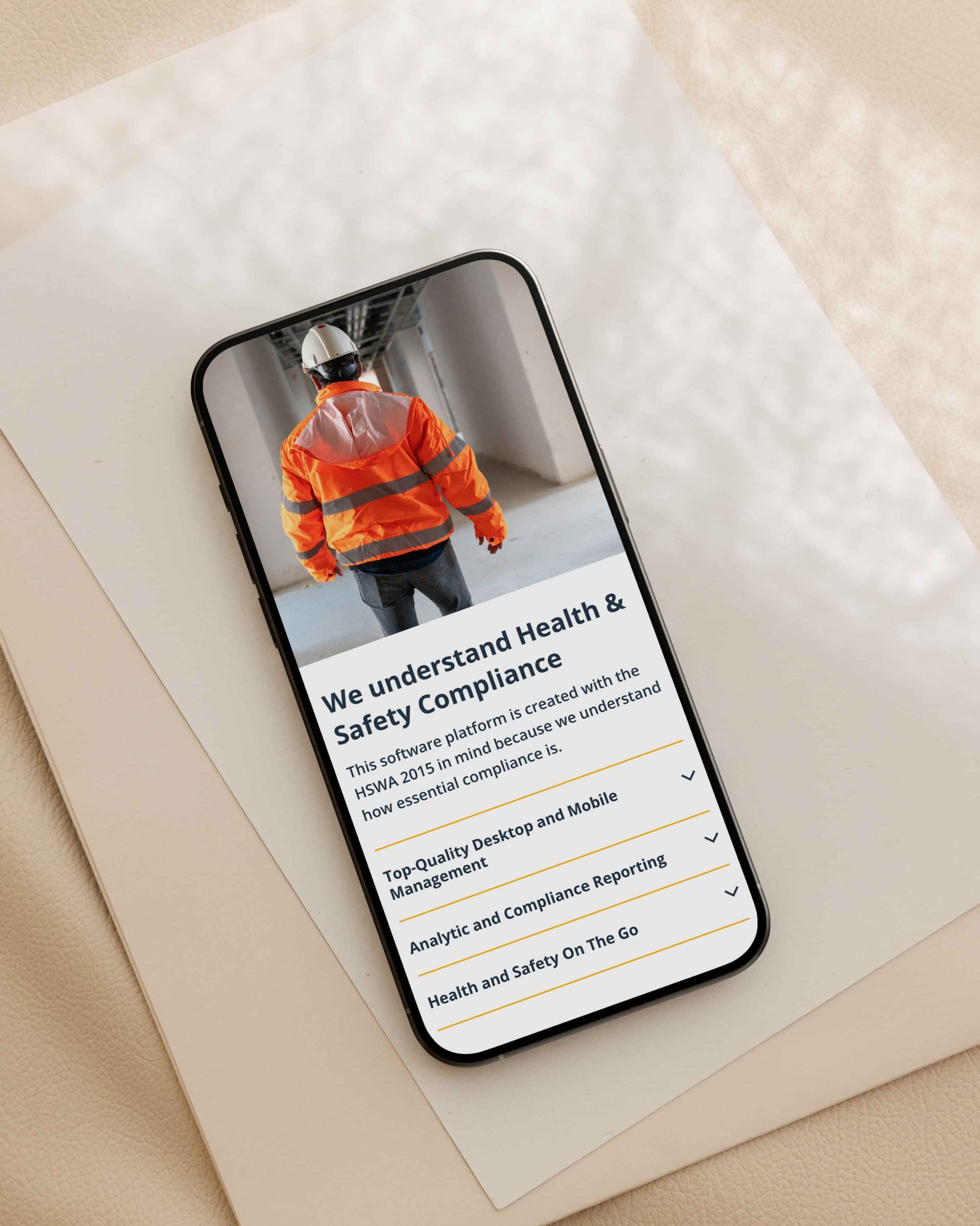
Accordion features to manage the depth of information neatly — keeping the page clean while still giving curious visitors everything they need
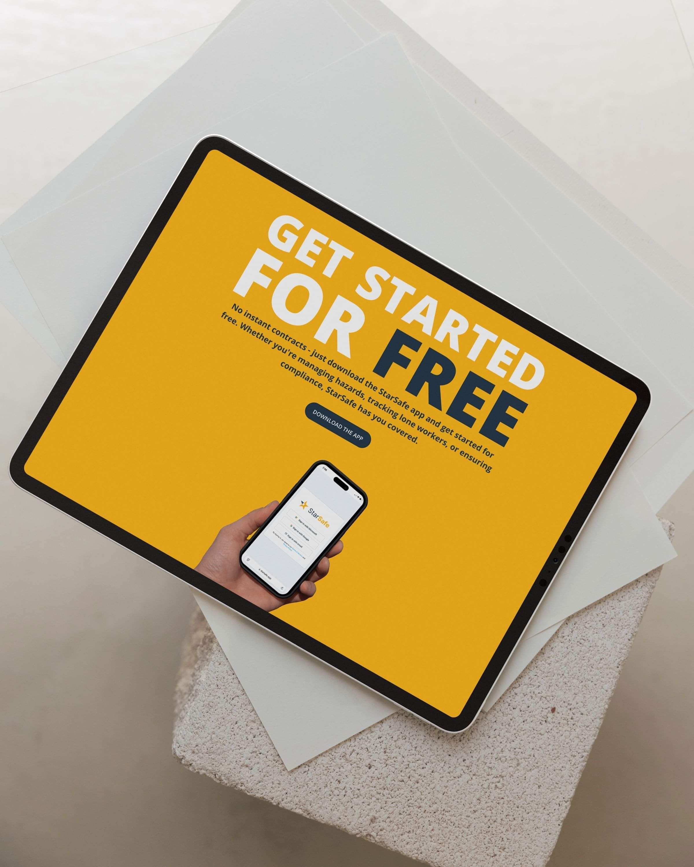
Yellow as the hero — used boldly and unapologetically throughout, making the StarSafe website instantly recognisable and impossible to forget in a sea of corporate navy and grey
The Solution
The result is a website that knows exactly who it's talking to — and talks to them directly, confidently, and with a healthy dose of personality.
No fancy stuff. No unnecessary complexity. Just a powerful, easy-to-navigate experience that makes the value of the StarSafe app immediately obvious and the next step — downloading it — completely obvious.
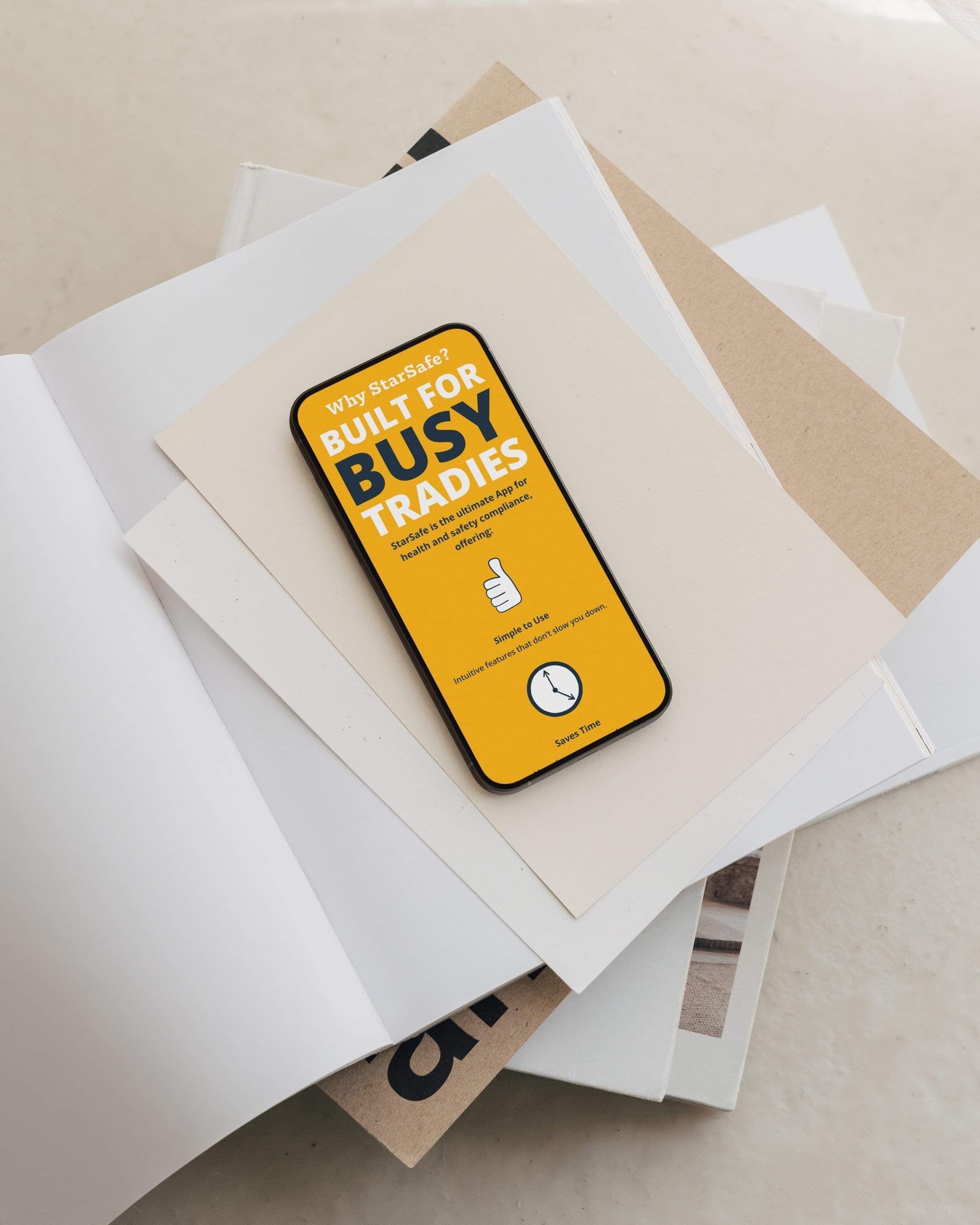
Bold, clear messaging that highlights key features without overwhelming
A striking yellow-led design that stands apart from every competitor in the space
Smart use of accordions and emoji to balance information with approachability
A clean, intuitive layout that works for busy tradies who need answers fast
The Results
StarSafe now has a website as bold, smart, and no-nonsense as the app itself — one that proves you can make Health and Safety genuinely engaging without sacrificing clarity or credibility.
They know their industry. They know their clients. And they were brave enough to show up in yellow while everyone else played it safe.
View the StarSafe App website here.
Copy by Courtney Haines.

Ready to work together?
Enquire today and let’s chat about your project and how we can work together.
Based in Kihikihi, Te Awamutu, working with ambitious growing businesses across New Zealand.

ABOUT
Creative Box is a design studio helping New Zealand businesses clarify their positioning and strengthen their brands with personality. Strategic branding, brand strategy & websites.
GET IN TOUCH
kelly@creativebox.co.nz
0272468761
INFORMATION
About
Recent Work
The Process
Blog
Contact