Naked Aesthetics brand case study
Project: Logo / brand design for Claire at Naked Aesthetics, Auckland
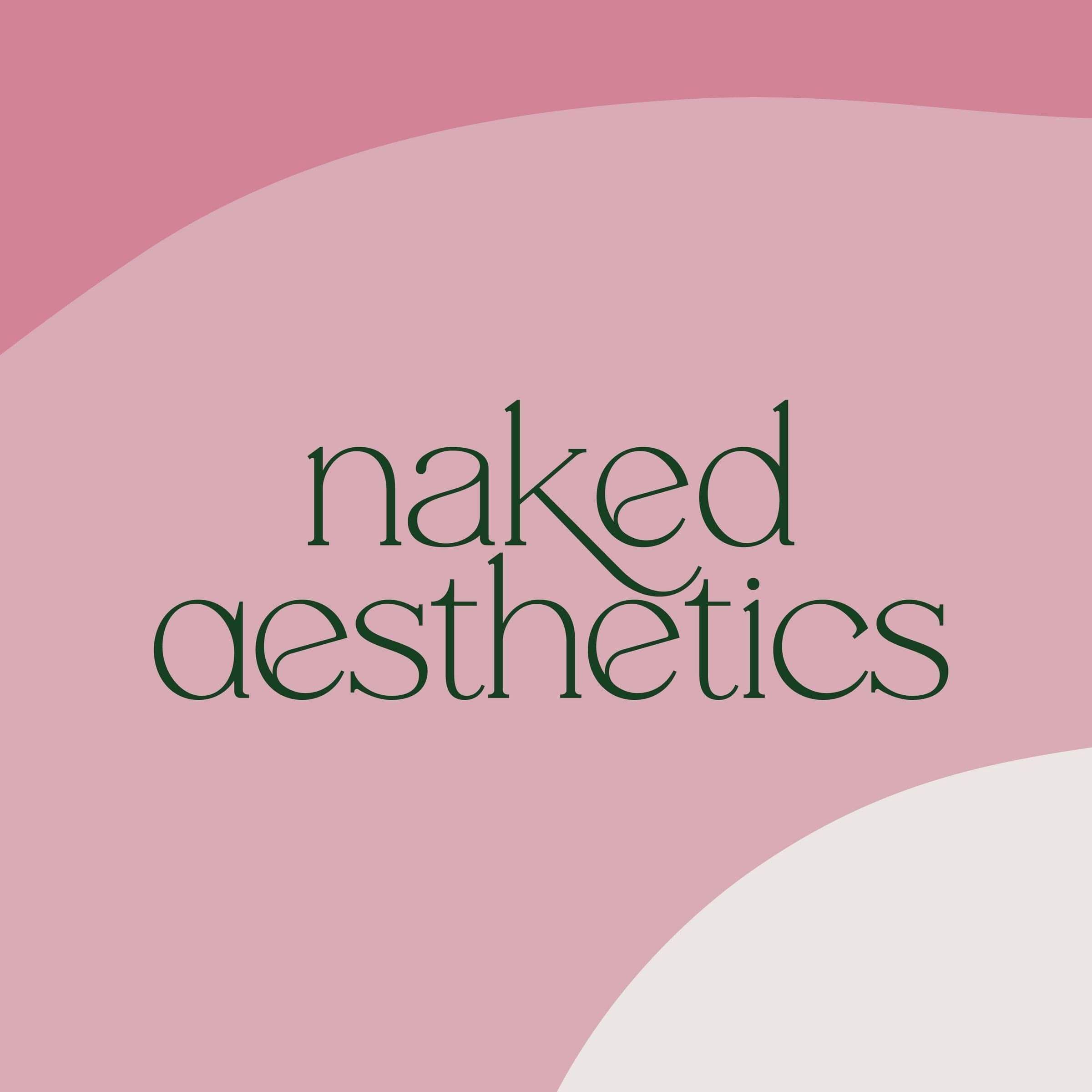
The Client
Get ready for a brand reveal that is chef's kiss from start to finish.
Claire is the cosmetic nurse behind Naked Aesthetics — enhancing natural beauty through cosmetic treatments that empower clients to feel genuinely confident in their own skin. Her approach is skilled, considered, and deeply personal. And her brand needed to say all of that before she even said a word.
The Challenge
The aesthetics industry has a look — and it's usually very feminine, very soft, very same-same. Claire wanted something different. Something that felt modern and clinical without being cold, playful without being frivolous, and inclusive without losing its edge.
She needed a brand that:
Balanced a fun, approachable personality with genuine clinical credibility
Felt clean, crisp, and current — no clutter, no fuss
Spoke to everyone — not just women — with a look that felt gender-neutral and genuinely inclusive
Stood out in a crowded aesthetics market without trying too hard
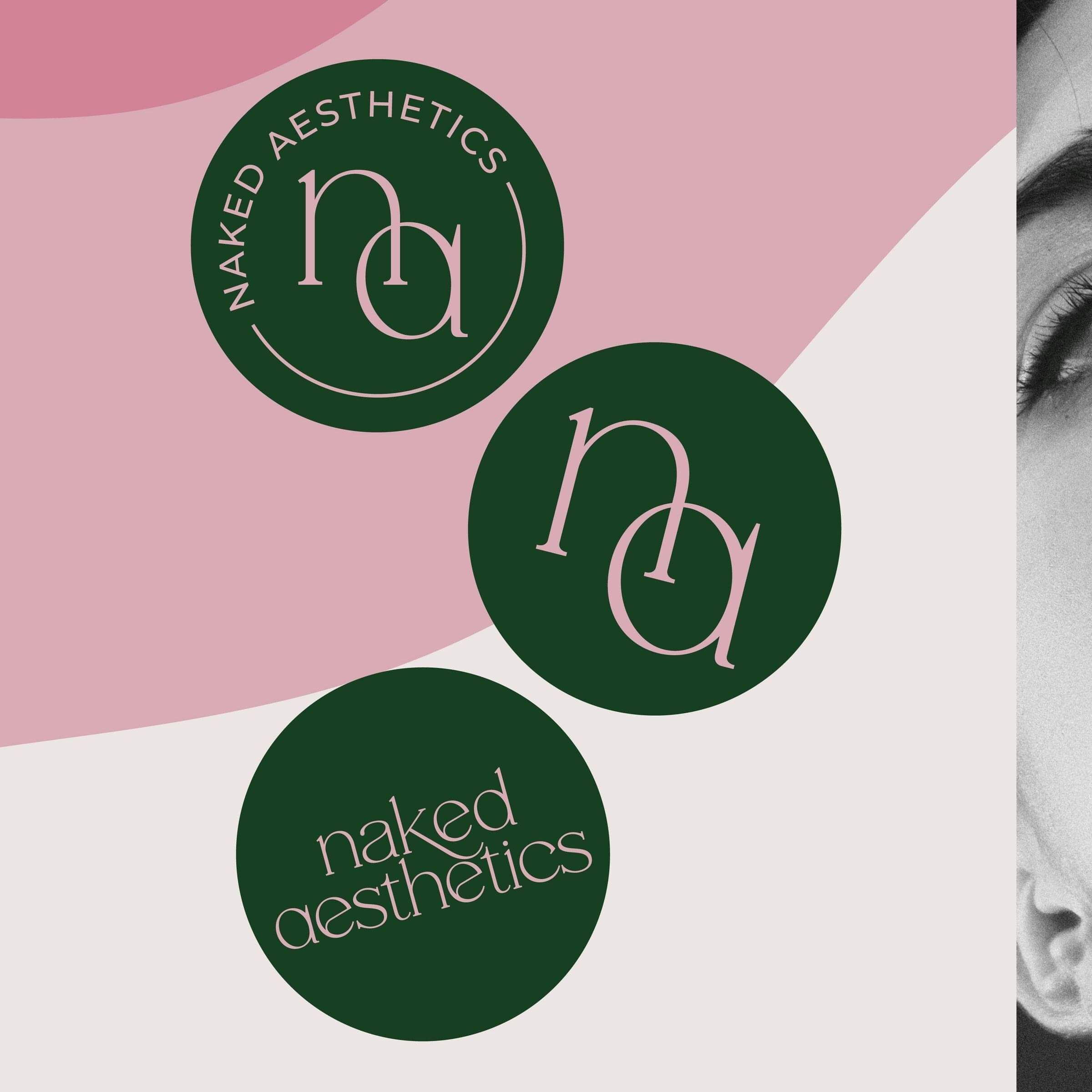
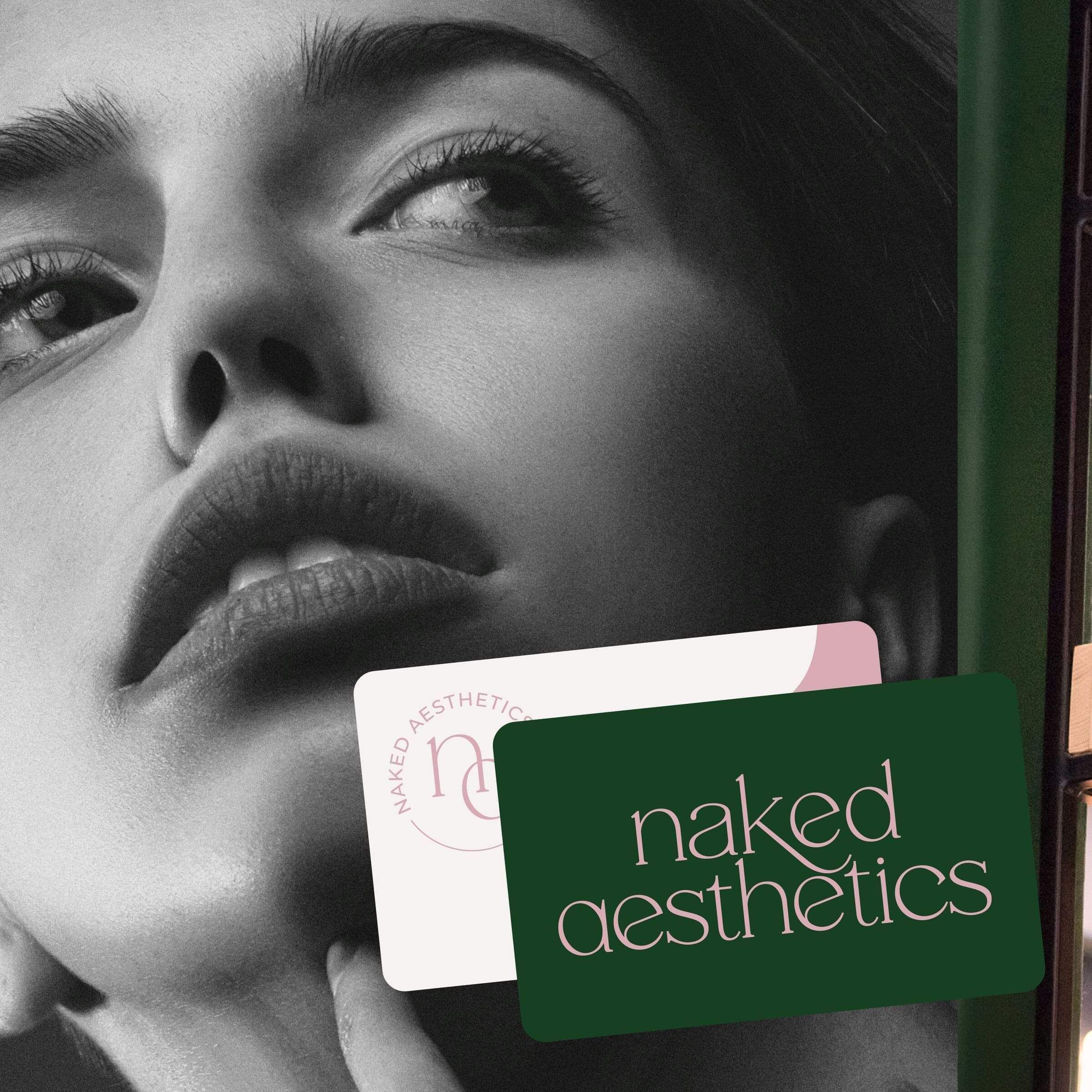
The Approach
We started with the tension at the heart of Claire's brand — fun and clinical, warm and precise — and leaned into it rather than resolving it.
Together we worked through:
Who Claire's ideal clients are — people who want to enhance what they already have, not change who they are; clients who value expertise, trust, and feeling genuinely seen
What makes her different — her empowering, confidence-first approach, and the care she brings to making every client feel comfortable and considered
What the brand needed to communicate — a sense of ease and playfulness that sits confidently alongside real clinical skill
Then we built the visual identity around that foundation:
Typography with personality — playful enough to feel approachable, structured enough to feel credible; the two working together rather than against each other
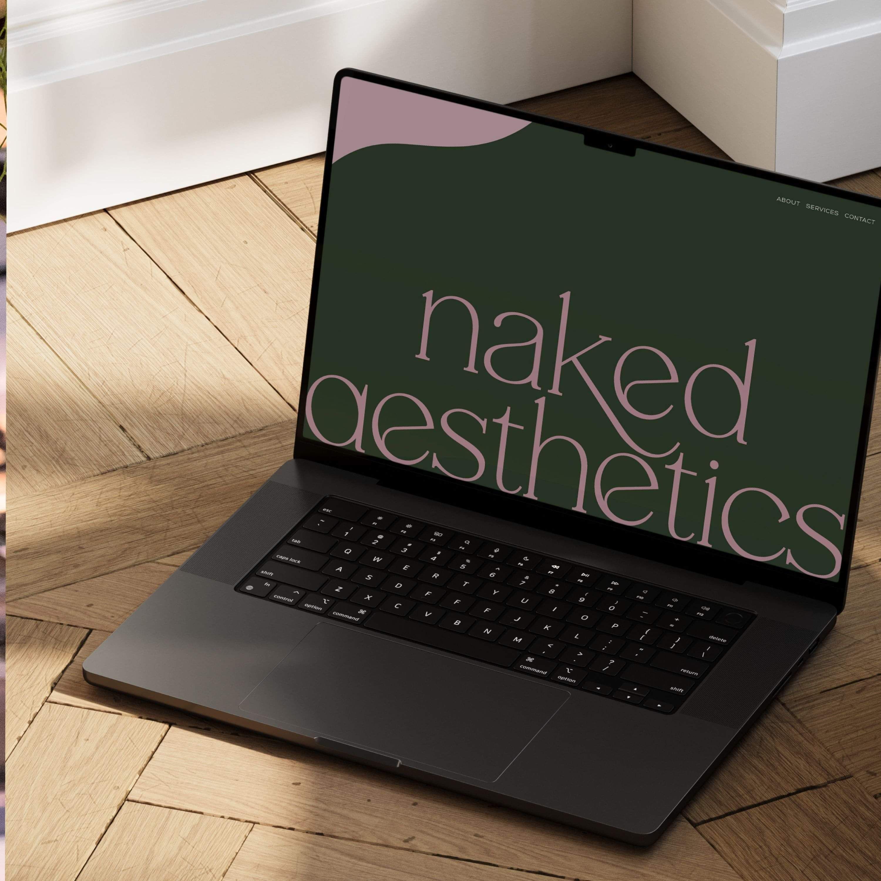
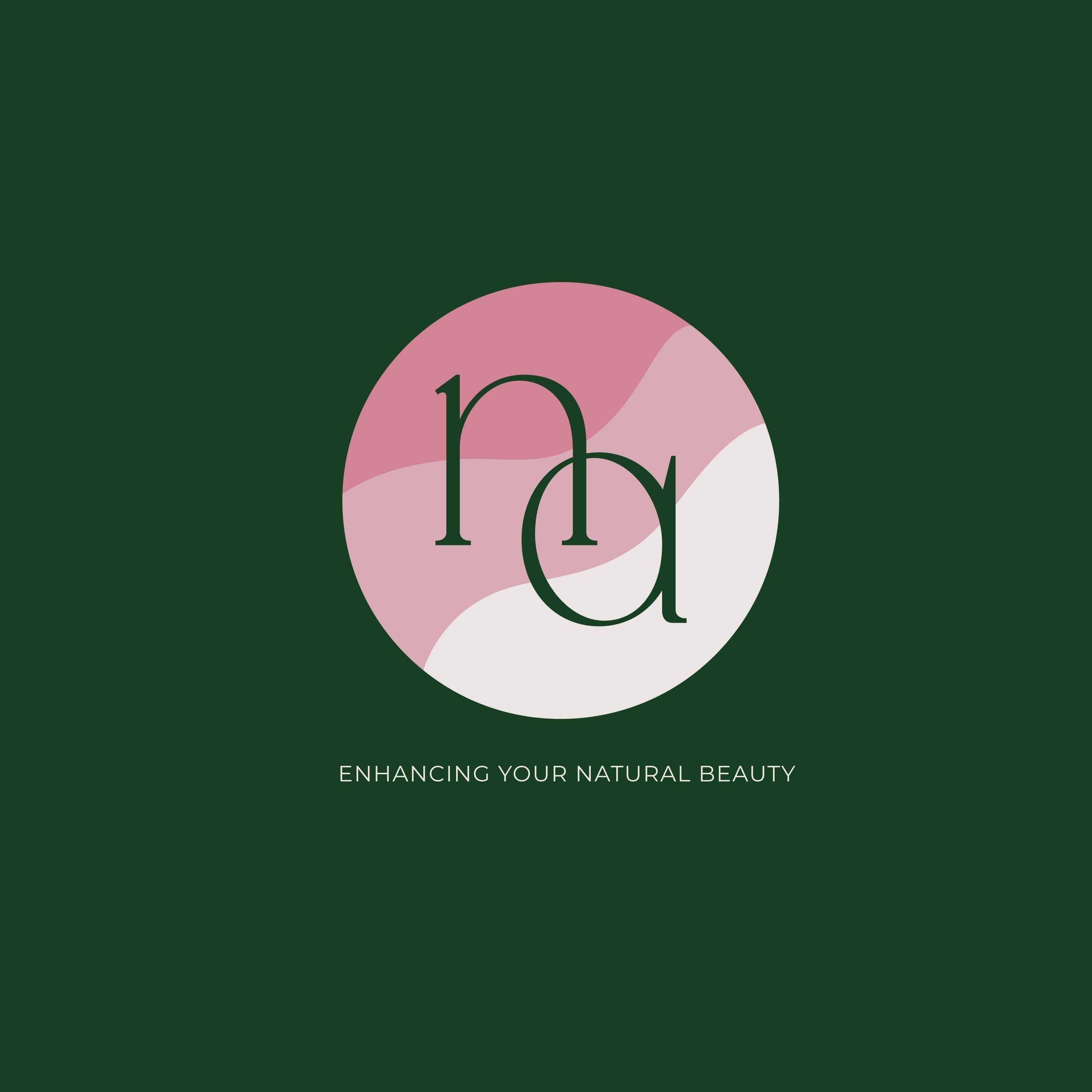
A fun, layered three-colour pattern that adds depth and character without compromising the clean aesthetic
Clean lines and modern colours — crisp and unfussy, with no unnecessary noise
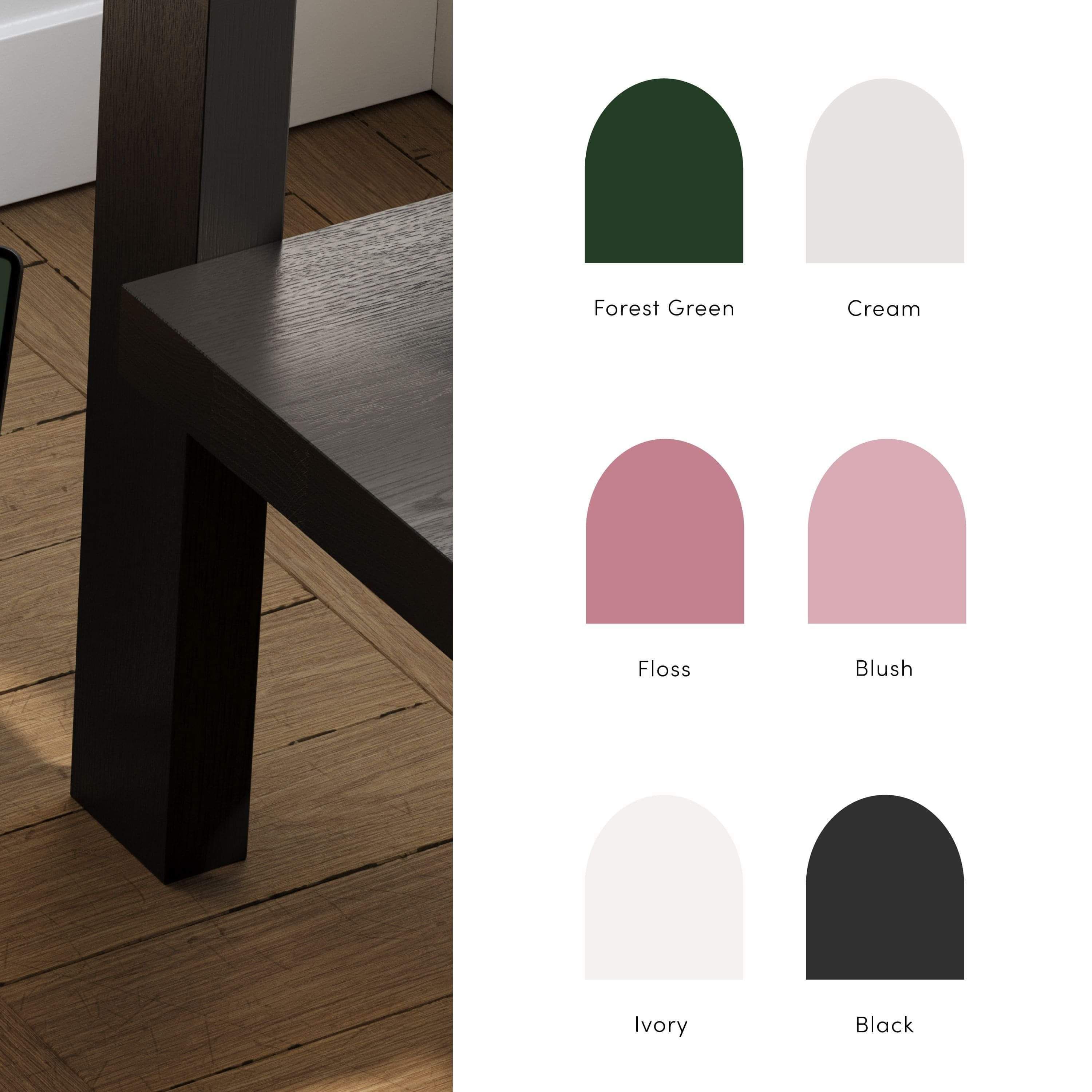
A strong forest green as the hero colour — grounding the brand in something gender-neutral and quietly confident, making Naked Aesthetics feel welcoming to everyone who walks through the door
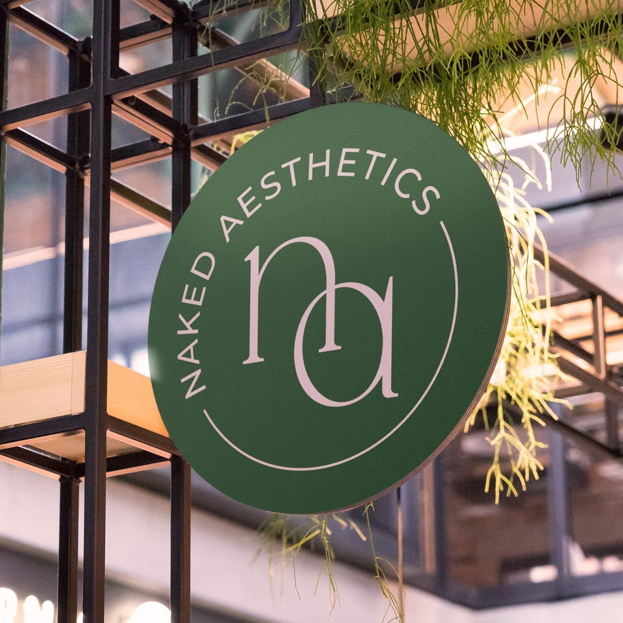
The Solution
The result is a brand that holds two things at once — and makes it look completely effortless.
Clinical and playful. Clean and characterful. Inclusive and distinctive. Every design decision was made with purpose, and it shows.
A visual identity that stands out in the aesthetics space without following the crowd
A colour world anchored in forest green that feels modern, inclusive, and genuinely fresh
Brand elements that work hard across signage, digital, and every client touchpoint
A cohesive system that gives Claire the confidence to show up consistently, everywhere
The Results
Naked Aesthetics now has a brand as polished and considered as the treatments Claire delivers — one that attracts the right clients, communicates expertise instantly, and makes everyone feel welcome from the very first impression.
Such a joy to bring this one to life.
Kind words from clients
"Kelly absolutely nailed it, her collaborative approach was refreshing. She was incredibly patient in understanding my vision and offered invaluable insights. The end result is a logo that not only looks amazing but also perfectly captures the essence of my brand. I wholeheartedly recommend Kelly at Creative Box for anyone seeking a top-notch logo design."
Claire Waterworth, Naked Aesthetics, Auckland
Ready to work together?
Enquire today and let’s chat about your project and how we can work together.
Based in Kihikihi, Te Awamutu, working with ambitious growing businesses across New Zealand.
ABOUT
Creative Box is a design studio helping New Zealand businesses clarify their positioning and strengthen their brands with personality. Strategic branding, brand strategy & websites.
GET IN TOUCH
kelly@creativebox.co.nz
0272468761
INFORMATION
About
Recent Work
The Process
Blog
Contact