BRANDING, ILLUSTRATIONS & WEBSITES
For business owners who love bold and creative design
Hi, I'm a Te Awamutu graphic designer dedicated to supporting New Zealand businesses with their branding, illustrations and websites. Carefully crafting irresistible and attention grabbing design that captures the heart of your business and attracts your ideal clients.

IRRESISTIBLE & ATTENTION GRABBING DESIGN
Nestled in the Waikato, Creative Box is a graphic design studio that delivers creative design for you to use consistently and confidently across all aspects of your digital and print spaces. I understand how busy it is to run a business so my approach to the process is to make it easy and stress free with lots of added guidance and support.


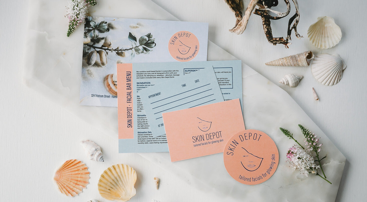
"Ahhhh Kelly I love it! You are one seriously clever lady, you listened to my vision (both wedding and business - cause only certain types of people would do both of those within 6 weeks of each other ) and then you brought them to life! Love, love, love the branding you did for me"
Laura, Skin Depot, Hamilton
SIGN UP TO CREATIVE CHATS
AND GET THE BIG REBRAND CHECKLIST
Plan that irresistible, attention grabbing new look for your brand. As an added bonus, subscribe to our monthly newsletter jam-packed with exciting content, hot new trends, and bold strategies tailored to elevate your business.
Say hello and book a consultation today
A boutique graphic design studio in the Waikato dedicated to branding, illustrations & websites
0272468761 I kelly@creativebox.co.nz
Kihikihi I Te Awamutu I Waikato I New Zealand
